 |
| Image Credit: Angelica Dass (Sourced from feature shoot) |
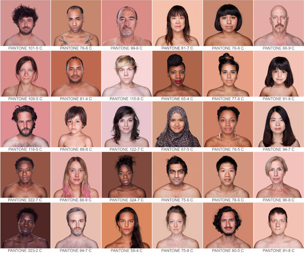
I thought this work on feature shoot yesterday was pretty in keeping with our recent discussions around photography and the body. It's definitely worth a look. View more of the images and read about the photographs of Angelica Dass HERE.
Speaking about the work in the interview, Dass states, “If what I wanted was to destroy the concepts of colors associated with race, such as red, yellow, white and black, it would not be logical to use a color scale that works with percentages of these colors. That’s why I chose not to use CMYK or RGB. Pantone works on a neutral scale, where a color has no more importance than another. It’s a very identifiable scale for those in the world of design, but also easily understood by anyone. It provides a way to look objectively at the ‘human object.'"
No comments:
Post a Comment