Tuesday, January 28, 2014

Darren Campion on Thomas Albdorf

Much of this article should resonate for students in Photo II in relation to our (all too brief) conversation on theoretical frameworks of/for photography.  Writing about the works of Albdorf, Campion suggests:

"However disparate these works may initially appear, concerned as they are with various sorts of photographic production, the sum of what Albdorf has created is a study of the medium that can grapple with its diverse and often contradictory uses. As photography does not submit to a unified aesthetic identity, any response to the sort of questions being asked here will necessarily have to contend with that characteristic evasiveness. If assuming that he is solely engaged with the investigation of photography as such is perhaps to define Albdorf’s work too narrowly – and indeed to misunderstand the wider consequences of photographic representation – reading across his various projects, it seems instead that they are a sustained effort to build a composite image of photography as a means of making the world visible, with each advance being a part of the whole. Albdorf’s diverse approach is ideally situated to untangle the mesh of possibilities that make photography what it is – and which, in turn, determine how it is used."

You can read the full article HERE.
And, to see more of Albdorf's work, click HERE.

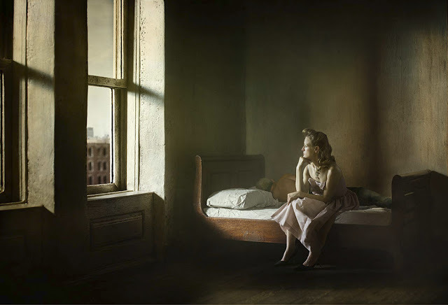
Image Credit:  Thomas Albdorf, from the series Former Writer (Sourced from paper-journal.com)

Thursday, January 23, 2014

Photography, and Art, and the Archive

Nice little article with loads of nice links to recent exhibitions and individual artists dealing with the archive in their work in Artspace yesterday (How the Artworld Caught Archive Fever).  Not surprisingly, photographs play a pretty central role in much (but not all) of this work.  I hadn't heard about Ryan Trecartin's staged portraits for W magazine until just now - pretty interesting...

"Even amateur archivists today have a overload of information to choose from thanks to the democratizing power of the Internet, making available everything from Google search results to streetviews and satellite images from around the planet to books and academic archives like JSTOR—a limitless trove of raw material that is enthusiastically incorporated into projects by artists like Ryan Trecartin and Jon Rafman, who make its provenance clear in their work. (Both artists appeared in the 2012 exhibition “The Artist as Archivist in the Internet Age” at the Bushwick experimental art space 319 Scholes.)

For Trecartin’s Web 1.0: A Lossless Fall, for instance, he staged four portraits for W magazine in 2010 using extensive Internet research to completely restylize the images, for instance digitally superimposing an Acura steering wheel on a model's face, coloring one eye the hues of the Brazilian flag, and giving him a hairstyle ("ankle length micro braids") found on a hair site—all with images sourced from the Web." - From Artspace, Jan. 22, 2014
A detail from Ryan Trecartin's 2010 W magazine photos - Sourced from Artspace

Tuesday, January 21, 2014

And, Speaking of War (Photography)

After posting a link to WAR/PHOTOGRAPHY at The Brooklyn Museum over the weekend, as often happens, I came across an article that certainly resonated with the issues brought forth in that exhibition.  It's actually a conversation between Iain Boal and Julian Stallbrass on the eitherand blog (highly recommended, by the way).  They pick apart quite a few historic and contemporary images, addressing the issues around the making and dissemination of photographs from conflict zones.  I was particularly interested in their initial discussion of an image (and a person) that has come to be known as the "Marlboro Marine" - one very likely recognized by many.  Digging into the story around this image (and of the human being depicted) is illuminating.  Below is a screenshot of an image search of the term "Marlboro Marine" - interesting in-and-of-itself.


I was pleased that the work of late photographer, Tim Hetherington was also referenced in the article, as his worked crossed over the museum/commercial space in pretty interesting way with his Sleeping Soldiers multi-channel video piece as well as the commercially released, Restrepo.

Their conversation also turned to a mention of Roland Barthes' analysis of the Paris Match magazine cover from Mythologies which then led me to think about a video piece made by Vincent Meessen which takes the (now) mythical picture described by Barthes as its point of departure.  And then, this line of thinking led me to think of other artists dealing with the imagery of militarization in more conceptual modes, such as Harun Farocki (and Trevor Paglen, who is mentioned in the conversation between Boal and Stallbrass).

• To read the conversation in eitherand.org, click HERE.

• To read about and view Meessen's video, Vita Nova, click HERE.

• To read about Harun Farocki's exhibition Images of War (At a Distance) at MOMA, click HERE.


Sunday, January 19, 2014

Hyperallergic's Take on WAR/PHOTOGRAPHY at The Brooklyn Museum

Interesting write-up on the exhibition mentioned in Photo II the other day by Betsy.

Henri Huet, “The body of an American paratrooper killed in action in the jungle near the Cambodian border is raised up to an evacuation helicopter, Vietnam” (1966, printed 2004), gelatin silver print, 13⅜ x 8⅝ in (34 x 22.4 cm), The Museum of Fine Arts, Houston, museum purchase (© Associated Press) - Image Sourced from Hyperallergic
"For more than a century and a half, America’s wars have taken place somewhere else. Over the past decade, flagged-draped caskets have returned and families have grieved. Yet less than one percent of the nation’s population has served in Iraq and Afghanistan, so this pain is well quarantined; the rest of us know about the widows and amputees because we’ve seen the pictures. It’s nowhere near enough knowing, but if you look unguarded it’s really too much."

Click HERE to read the article in Hyperallergic, and click HERE to link to the Brooklyn Museum's page on the exhibition.

Wednesday, January 15, 2014

Another (digital) take on Robert Frank's, The Americans

I was just made aware of what I believe is a new project by Sherwin Tibayan based on The Americans via In the In-Between blog.  I'm initially pretty interested in this project, but with a bit of hesitation.  I did especially enjoy reading the artist's narrative discussing their very personal experience with Frank's seminal book. 

Image Credit:  Sherwin Tibayan (sourced from In the In-Between)
I'll have to come back to it to see whether my thoughts change, as they have regarding Mishka Henner's rendition (I've grown much fonder of these spare, abstractions over time - they remain true to the quiet, lonely quality or the originals, in many ways).

Image Credit:  Mishka Henner (sourced via mishkahenner.com)


Tuesday, January 14, 2014

Richard Tuschman's Hopper Meditations

There's been a bit of a lull here, but time to get posting items of interest again as I've got a brand new batch of fantastic students for the spring semester. Photo II students might find particular interest in this series by Richard Tuschmann, as it relates so nicely to their first assignment exploring color, light and narrative.  
From the series, Hopper Meditations by Richard Tuschman (image sourced from Explorers.com)
I came across these images yesterday when they come through my newsfeed via the Art Photo Index (a great resource).  I was immediately captivated by Tuschmann's take on Edward Hopper's painterly style - although, after a more prolonged look, I'm not sure how I feel about the somewhat pictorialist strategy employed, which seems to be unnecessarily used.  The selective focus (or post-processing blur?) calls too much attention to itself and the grainy quality reads as a bit of heavy-handed filter use (it could indeed be scanned film grain, but I'm noticing it in a way that makes it a bit distracting to me).

Overall, they just seem a bit too "arted up."  I recognize that Tuschmann is deliberately aligning these works with paintings, but for me they may be stronger without all the extra, stylistic artifice (the fabricated scenes, set design, positioning of figures and theatrical lighting in and of themselves are where the strength of the work really seems to lie).